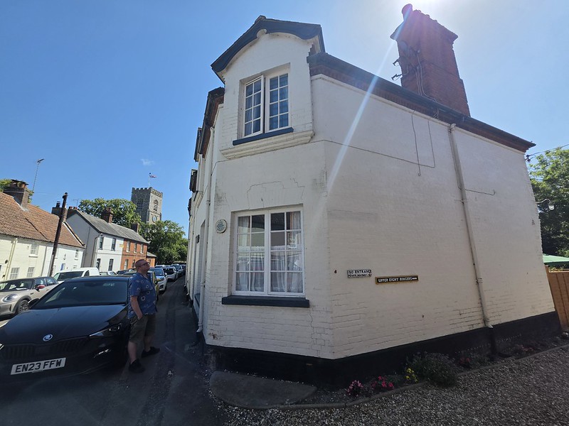
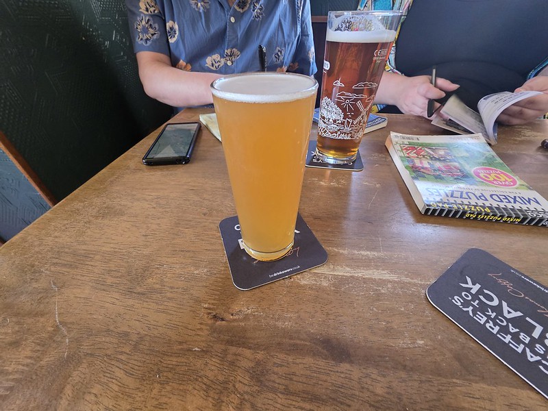
This was once the Eight Ringers pub in Wells which was a licensed premises between the late eighteenth century and 1971 when it finally closed. It was initially a free trade pub before becoming part of Bullards and then Watney Mann, but they didn’t feel that the venue was viable and it is now split up into flats.
It came up for sale in 1904 and it was advertised as being:
“A fully licensed public house with large yard, good stable and outbuildings, suitable for any trade”.
The landlord between 1905 and 1909 was Frederick Powell and he seems to have been something of a character. He was charged of being drunk in his own licensed premises and then using bad language to a police officer who was investigating the matter, with the fine for the bad language alone being 9 shillings including the costs.
The pub seems to have struggled with their landlords as the long-standing Eleanor Cross was at the premises for over thirty years and was found guilty of adding water to whiskey. The situation seems complex, she claims that the inspector made her open a bottle which she never tried to serve from and she claimed that was her own whiskey as “her heart was bad” but the court didn’t believe it.
The landlord between 1947 and 1961 was Frank Moore and then his wife managed the house between 1961 and 1966. She attracted the interest of the national newspapers in 1962 when her 40 year old cactus bloomed with nine buds. She was so excited that she moved it to the bar and customers could see the buds blooming in front of them. They then all died overnight, so that was the end of that excitement.
There’s a plaque on the building from a local history group, otherwise I would have known that this used to be a pub. As for the name, a traditional English ring of church bells can consist of eight bells, each with its own ringer, which presumably explains the Eight Ringers. There were periods in the pub’s early history when it was instead known as the Six Ringers, so goodness knows what happened to the other two. Perhaps they had been barred.
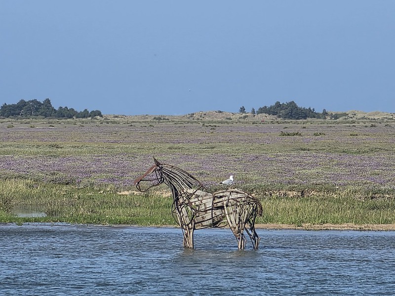
Shortly after we arrived in Wells I noticed this sculpture before we meandered to our first pub in the town. It transpired to be one of the more distinctive sights in Wells Harbour and it’s known as the Lifeboat Horse, a three-metre-high sculpture standing out on the sandbank opposite the harbour. It was created by Norfolk artist Rachael Long for the Wells Heritage Art Trail in 2018 and commemorates the working horses that once helped launch the town’s lifeboats.
The inspiration for this arrangement came from an old photograph shown to Long by Wells Harbour Master Robert Smith, depicting the lifeboat being hauled by five pairs of heavy horses. During the nineteenth century, the horses could be called upon to pull the 33-foot lifeboat around two and a half miles from the quay to Holkham Gap for launching. The horses weren’t kept solely in reserve for maritime emergencies either, as they normally earned their keep by hauling heavy cargo around the harbour.
The sculpture is made from steel bars and pieces of whisky barrel and is secured to the seabed with substantial metal pins, which seems sensible given that leaving a three-metre metal horse casually unsecured in the North Sea would introduce an unnecessary element of excitement. Its position also means that the appearance changes considerably with the tide. At low water the whole horse stands exposed on the sand, while as the tide rises its legs disappear and it starts to look as though it is standing, or perhaps wading, in the harbour. And fortunately for the increasingly demanding photographic requirements of this riveting blog, by the time we returned later the tide had come in.
I rather liked the whole changing relationship with the water, as it stops the sculpture simply becoming another static piece of public art. I photographed it at different stages of the tide and it looked quite different on both occasions and I hadn’t expected that. And as is visible in the photo, a seagull had also taken up position on its back. The horse wasn’t originally intended to become a permanent feature. It formed part of the 2018 Wells Heritage Art Trail, which included 17 works by 26 Norfolk artists, but it proved sufficiently popular that a campaign was launched to keep it. The local community subsequently raised the £15,000 needed to buy and reinstall the sculpture, with donations coming from businesses, residents and even local children so it returned to the harbour in May 2019.
It isn’t quite permanent in the literal sense, as the Lifeboat Horse is removed during the winter to protect it from the harsher weather and returned in spring. Moving it requires a boat with a crane so it all sounds like a bit of a hassle, although its secondary role as a £15,000 seagull perch should not be underestimated.
The next pub on my little day out in Norfolk with Roy and Jen was to the Bowling Green pub in Wells. I had dragged them both to St. Nicholas church in the town, but more about that rather lovely building in another post. Well, possibly. My queue of things to blog about is now expanding considerably faster than my ability to write any of them. At the present rate, the church should appear on the blog sometime before 2034.
The venue has a long history and has been a licensed premises since perhaps as early as the late eighteenth century, so it might be the oldest in the town that is still open. Norfolk Pubs notes that it was owned by the Dereham Brewery, then Steward & Patteson, Watney Mann, Brent Walker and then Pubmaster before it became a freehouse. Planning permission was granted in 1999 to turn the venue into two houses, but fortunately it survived as Wells already has houses and historic pubs are rather harder to manufacture.
I liked all the clear signage and this felt like a traditional pub with some events going on. There was something of a rustic feel, but it was carefully designed and there was also a separate dining area which all looked like someone had thought about rather than assembled together a heap of random furniture over thirty years or something. I like the mixture of high and lower seating and there was a garden area as well for those who like sitting with wasps and pretending this constitutes relaxation.
The interior with its stone floor and although this would have no doubt made a lovely house, it’s definitely better as a pub.
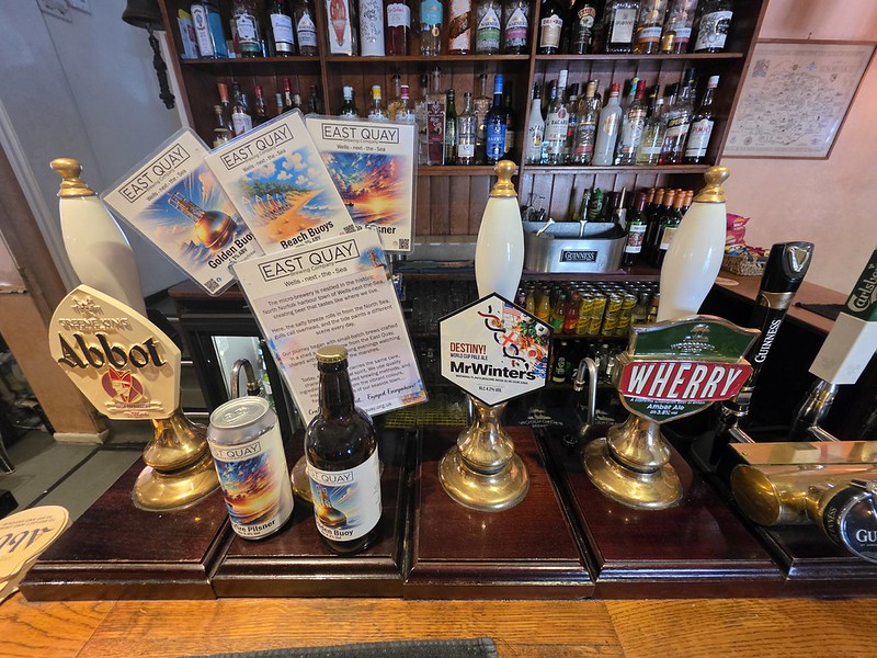
There were three real ales available and also some bottle conditioned beers from East Quay brewery.
I like the clarity of this as it isn’t always obvious where those going into a pub just for a drink are actually meant to sit. A sign saying ‘drinking table’ makes this process much easier and I like precision.
This is the Destiny from the ever reliable Mr Winter’s Brewery and it was clean tasting, hoppy and agreeable. This appears to be a rebrand of another Mr Winter’s beer which makes the process of putting it on Untappd rather more complex than I’d ideally like.
I liked this pub as it clearly served the local community whether they wanted food or drinks, with everything clean, well managed and organised. The venue is well reviewed online and seems a reliable option for food, with rooms also available here for those wanting to stay overnight. It has managed to broaden what it offers without losing the feeling that it is fundamentally still a proper pub, which is not always as straightforward as it might appear.
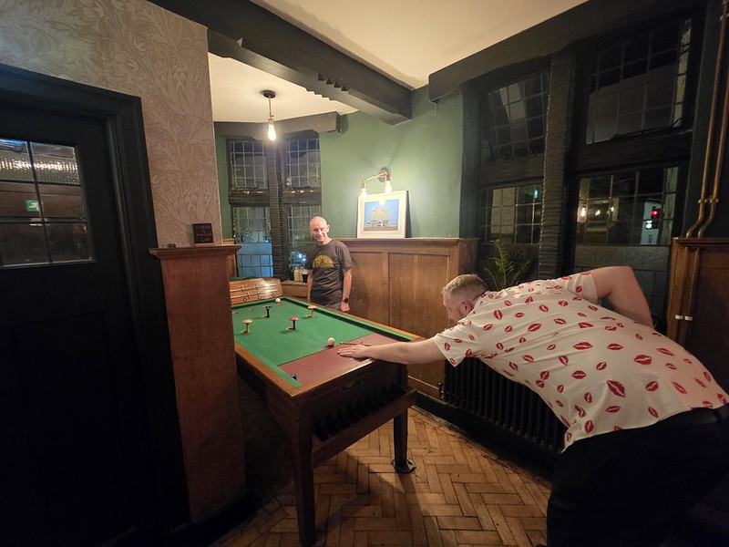
It’s only a few days left before the bar billiards tournament that I’m organising at the Artichoke pub on Saturday 22 August 2026. I say “organising”, but I really mean “delegating to everyone else” in my finest traditions. I have, however, successfully assembled 24 players, which means the tournament is now full for entrants and therefore demonstrates that I’ve done at least one thing. I think that there are players from nine different teams which is all rather lovely.
Although all of the playing places have gone, spectators are very welcome and I’d actively encourage anyone interested in bar billiards to come along. It’s intended to be a competitive tournament, but also a sociable afternoon and an opportunity for people who haven’t played before to see what the game is all about. Bar billiards is one of those sports that initially appears to consist of people standing around a wooden table drinking beer and occasionally poking things with sticks, before gradually revealing an alarming quantity of tactics, rules and emotional investment. I would add that anyone who stands around for too long might be given a little administrative task or signed up for the second Artichokes team next year.
The event will start at 14:30 and the draw is taking place just before for anyone who wants to come and watch it. Dylan from Articans is overseeing the draw, not that he’s been told this yet, but he likes surprises. He’ll also be managing the scores throughout the afternoon, which is another exciting development in his life that he is currently unaware of. I’m hoping he discovers all of this by reading the blog, which I think counts as a perfectly modern communications strategy.
The draw will determine the pairings and then we’ll work our way through the tournament during the afternoon. With 24 players involved there should be plenty of bar billiards being played, along with the traditional periods of intensive statistical analysis, tactical discussion and somebody asking when they’re playing next despite the schedule being immediately in front of them. I’m hoping I don’t hear “they’re just having a cigarette” or “I think they’re in the toilet” too often when a player is meant to be ready….
The early betting appears to have YouTube Pete and Badger as the most likely winners, although this is plainly incorrect because Luke and I are going to win. I’ve undertaken no statistical analysis to support that conclusion, but confidence has never needed evidence before and I don’t see why it should start now.
There are plenty of dangerous combinations elsewhere. Oscar will be bringing his decadent chalk to the tournament, an item of bar billiards equipment so extravagant that I’m surprised it doesn’t require its own security detail. I still don’t entirely understand how chalk became a luxury item, but bar billiards continues to reveal new economic sectors to me. And I just play with the pub cue and haven’t invested around £300 in some lightweight stick. Actually, with members of the Lionhearts team, there’s every possibility that by next year we’ll need equipment regulations and a salary cap.
Danish Pete is now playing and might be one of the finest players in the field if he’s not distracted and annoyed at something. His inclusion has though rather damaged my preferred narrative that Luke and I simply have to turn up and collect the trophy. Steady Roy from the Serengeti will be there, presumably maintaining exactly the same facial expression whether he’s 2,000 points ahead or has just knocked over every peg.
The Artichoke Hearts combination of PJ and Vaughan could also be difficult to overcome as they know the table well. Then there’s Dave Brewer, who I beat in the league this year, have I mentioned that? Playing with Phil, that means that we have rule experts should we need it. Although thanks to Luke for being the official tournament referee, a role he didn’t know he had until I discreetly popped it in the rules. Incidentally, for anyone who has somehow missed the previous seventeen references to me beating Dave this season, further reminders will be available throughout Saturday.
Then there’s the Sharp tribe from the White Lion, as well as some talent from the King’s Head, including some quite vocal talent. The Sharp tribe can’t be ruled out as they’re at the Artichoke table on Wednesday night, but fortunately I’ll be there to play some games in a little friendly just to ensure that they don’t get too much table time. I regard this not as interference with a rival team’s preparation, but as responsible tournament oversight.
YouTube Pete will be recording games during the afternoon, so we’ll hopefully have some footage of the tournament afterwards. There will also be a clearly designated non-recording area for anyone who doesn’t want to appear on camera. This is particularly important for those who might prefer not to have permanent video evidence of themselves eating 28 Flumps over the course of the afternoon. By “those”, I principally mean me. I’ve effectively created bar billiards VAR with a designated confectionery privacy zone and I’m quite proud of that. The videos should be a nice record of the event and, depending on the results, material that some competitors may subsequently demand is destroyed. Any footage of me losing comprehensively will, naturally, be subject to a rigorous editorial process before publication.
Articans and the Artichoke are sponsoring the event, many thanks to Julian the Old for providing the 50 pence coins for the games as well as some spot prizes throughout the day. The event is aiming to reach at least £50 for Big C, as well as offering prizes for the winners, runner-ups and some random players around the day. These are big prizes, the winners get £35 and the runner-ups get £20, so this is no provincial little league asking players to take part for exposure…. The random awards may reward sporting excellence or they might reward something considerably less impressive.
I have some bad news though, Ivan the Great won’t be appearing as the event filled quickly, but he’s off to a beer festival instead. This is fortunate as otherwise players might get annoyed as he shares his top tips throughout the day. I’ll miss him though. He will be a contender to win next year’s event….
And, there’s more! Luke has acquired, at great expense, some trophies for the event and I’ve seen them and they’re really rather lovely. They will be worth playing for and there’s something for the ‘worst’ team as well, because this is all about taking part and not just winning. Many thanks to Luke this and indeed planning the format of the games as my designated responsible adult.
As a final note, the plan is to run this event as a much larger affair next year so that we have an entry process that allows as many people to enter as possible. That will mean operating it across likely another couple of pubs and I have high hopes that Oscar might be a host at the White Lion if he’s not in a mood that he’s knocked out early on this weekend. Actually, the long-term vision appears to have escalated from ‘small doubles tournament’ to ‘multi-venue Norwich bar billiards infrastructure project’ remarkably quickly and I’m hoping that next year some teams from around the country might make it to the great city of Norwich. Mission creep and all that…..
And in the words of the league:
“It’s Meant To Be Fun!”
Although I’d add that I don’t want too much frivolity on Saturday and I will say in advance that I will call “timed game” if required, as that’s what Emma would want me to do. I’m hoping that things are finished, or near to completion, by 20:00 as if we’re still going at 02:00 then something has gone wrong. And if Saturday works, I’ll take full credit. If it doesn’t, this blog post contains ample documentary evidence that I delegated most of the important jobs. But I think it’ll all be very lovely.
The next venue on our list was the Edinburgh pub in Wells, which has been a licensed premises since the late eighteenth century. Originally known as the Fighting Cocks, it took the name of the Leicester Arms until 1887 when it was renamed by the Scottish landlord James Alexander Davidson as something he felt to be more agreeable. And that name has stuck since.
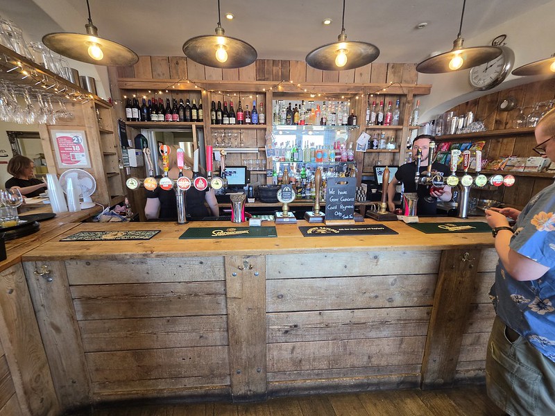
Apologies for the lack of real ale photo, but the landlord was standing right behind those pumps most of the time and I didn’t want to be too intrusive. Anyway, they had a choice of three real ales available.
The interior felt reassuringly traditional, with carpet, wood and the sort of layout that still unmistakably feels like a pub. It was all entirely agreeable. The far end of the pub is a restaurant, named Ollies, which seems to be sub-contracted out, so it’s a different operation but still firmly in the same building. That meant this end of the pub is for drinkers and I liked the clarity of the arrangement.
And I liked the nod towards heritage, a bit of local history is good for the soul. Less spiritually nourishing, although potentially more immediately useful, was the bar snack range listed nearby to tempt those of weaker resolve.
I rather like a wheat beer and I went for the Blue Moon, although it’s the first time in a long while that it hasn’t been served with a slice of orange. I managed to contain my disappointment with considerable dignity. Roy went for a Woodforde’s Wherry and I understand that it was well kept and at the appropriate temperature and all that.
I liked this venue and it had a feel of being a proper pub for locals whilst still being welcoming to everyone. It’s a little walk from the quay, but I think it’s worth the little meander.
I’ve decided to write about this pub as Roy did get a drink here, but I think it’s fair to say that this venue isn’t really targeted at me. That’s not necessarily a criticism in itself, as pubs have to appeal to rather more people than just me, inconvenient though that may be for them.
There are decent views over the quay and the venue has a prominent location in the town. The venue has a long history, it has been a licensed premises since the middle of the eighteenth century and in more recent times it became part of the Bullards, then Watney Mann, then Pubmaster and then Punch Pubs estate. The listed building notes mention:
“Early C18, much modernised. Brick and pantiled. Front, pebbled and plastered. 2 storey and attics. 3 casement dormers. Eaves cornice. 2 sash windows with glazing bars remain at 1st floor, altered centre window with casement. Rusticated quoins. Dutch gable. Interior: oak open stair well said to be included.”
So it seems much has been lost internally, likely a long time ago, and it did feel a little soulless inside.
Jen had disappeared at some point and returned with what can only reasonably be described as an enormous ice cream from somewhere nearby. She then stood peering through the pub window while eating it. Roy and I decided that asking questions would probably only encourage matters, so we left her to it and didn’t say anything.
I was marginally amused that the menus on the tables advertise these bar snacks. A customer tried to order them and was told in quite a direct manner:
“It’s Sunday, you can’t order bar snacks”
I’m afraid I’m with the customer, it’s a little sub-optimal to be dismissive of someone trying to order food as it doesn’t say anything that they can’t be ordered on a Sunday.
The beer range was fairly generic and there wasn’t anything that particularly excited and delighted me, so I decided against ordering a drink myself. It does feel a shame that there’s no attempt at localisation here at all, even the real ale that they didn’t have is a generic national offering. CAMRA notes that real ale is often unavailable and it’s only ever Timothy Taylor’s Landlord when it is available. It’s also card only, which I have no view on, but I’d say that’s quite brave for a venue of this size.
Ultimately, it’s positive that the pub remains open in such a prominent location and is contributing to the life of the town. It was busy enough to suggest that plenty of people appreciate what it offers, which is considerably more important to its future than whether I personally felt an overwhelming urge to move in. Roy got his drink, Jen had acquired an ice cream of almost architectural proportions from somewhere and I had obtained another blog post, so everyone emerged from the experience with something.
Next on our tour was the Norfolk Bottle Shop, located near to Wells-next-the-Sea and pretty much in the middle of nowhere. It’s great if you want to get away from it all, but as someone who likes “all”, it’s not my natural habitat. My first concern as we were driving into a farm was that I wouldn’t have a mobile signal for Untappd, but, fortunately, it transpired it was better than the signal that I get in Norwich.
There were plenty of bottles available from a range of different breweries.
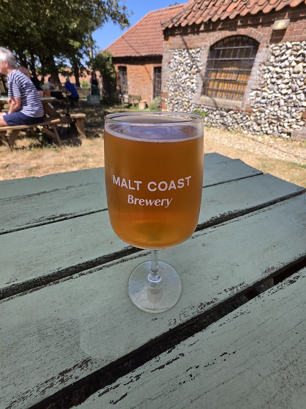
I don’t like differential pricing like this, I’d rather half a pint was half the price of a full pint. If it had been, I would have tried halves of two different beers. Anyway, I don’t want to sound like a CAMRA obsessive with this and so I won’t digress far as otherwise this is exactly the sort of minor pricing issue that can occupy me for considerably longer than would be considered healthy by most normal people. There were four beers from the Malt Coast Brewery and this is effectively their taproom, with the service being friendly and welcoming.
I went for half a pint of the Malt Coast IPA and it was piney and bitter, although I’m not sure that it was entirely well rounded. Incidentally, my drink was considerably over-poured so I was surprised and delighted.
The indoors seating areas and there is an apology for the swallows’ nest which has meant that the table area isn’t the cleanest. But, it was the middle of summer, very few people would have been opting to sit inside. Well, I would, but that’s a different matter. Anyway, the squatters seemed quite happy with their nest and this is their natural habitat, so I can’t begrudge them that.
There are six glamping tents on the site and there’s pizza available during the summer weekends. The pizzas that were being served looked rather delicious, but it was still early on in the day although I was a little tempted.
It was an interesting location and I hadn’t heard of it, but Roy seems to have heard of most drinking places, whether they are obscure or not, in Norfolk so that’s always useful. I was pleased to find a shady spot outside in the beer garden, the team member was friendly and there were lots of beers to drink in or takeaway. They’re also proud of their locally grown barley, so it ticks all the local sourcing boxes which is rather lovely.
It’s taken me a little while to start writing these up, but a few weeks ago, the delightful Roy and Jen, as well as myself, went to a number of pubs in Norfolk and to delight my two loyal blog readers, I thought I’d better write them up. This is the Black Lion Hotel and it has been a licensed premises since the mid eighteenth century. For a long time this was a Bullards pub, it got swept up in the Watney Mann estate before eventually being taken over by Enterprise Inns. It’s now owned by the small pub Pickled Inns company which also operates the Carpenters Arms in Wighton.
The earliest I can find the pub mentioned in newspapers was in the Norfolk Chronicle on 2 May 1778 when a meeting was held at the Black Lion to discuss how to deal with horse stealers. This is the historic equivalent of cars being stolen and it was a serious issue at the time, which explains why there around 80 subscribers to the committee who wanted to tackle the problem in the area. It’s easy to think that little changes, but on the same page on the newspaper there’s an update on the French joining in the American War of Independence.
On 4 April 1908, the pub was advertised by Bullards to let in the Downham Market Gazette with the text:
“Large posting trade. Good stabling accommodation and yard. Fine bowling green, bar, smoke room, commercial room, usual domestic offices, nine bedrooms”.
I’m not sure when it was decided to get rid of the bowling green, but there were regular matches played there in the early twentieth century.
There was a friendly welcome from the team member and there were bar snacks visible, which is always a positive start to proceedings. The front bar is more for drinkers and there’s a larger room at the rear which was busy with diners. I liked how they’ve differentiated this space so that drinkers and diners all felt that there was a place for them. The food menu is mainly traditional pub meals and the price point is towards the higher end of the scale, but it’s all generally well reviewed.
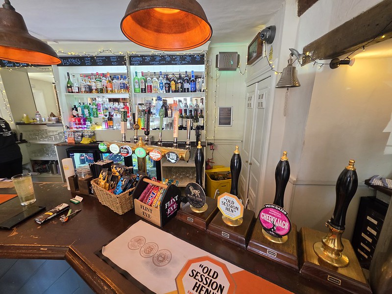
There were three real ales, although as this was such a warm day I did wonder how the pubs would cope with the beer temperature. This is a real challenge for pubs as even if the cellar is kept cold, there’s the danger that the beer in the lines gets warm before it’s poured and that’s even more evident for people like me who order half pints.
I opted for the Cheeky Jack from Moon Gazer, a rather lovely local brewery, and the beer was perhaps very slightly warmer than I would have ideally liked, but it was hoppy and had a pleasant orange flavour to it.
The front bar and it was all clean, tidy and organised. The pub also has six bedrooms and looking at the website, these looked comfortable and well appointed.
This was all a rather positive first pub of the day: decent beer, a choice of ales, a clean and comfortable environment and a friendly welcome. Most remarkably, Jen hadn’t annoyed me yet. Admittedly, it was still only the first pub.
I arrived at the new King’s Lynn Library in a slightly unhelpful frame of mind, because I had already decided that I wasn’t going to like it. This was not based on having actually entered the building, which would obviously have been a more conventional approach to reviewing somewhere, but because I liked the old Carnegie Library on London Road and was sorry to see the library service leave it. I was therefore pre-annoyed by its replacement, which at least saved valuable time having to become annoyed once I arrived.
This is the new ground floor area of what was Argos, although the old library had rather more history on its side. Designed by H. J. Green and built in 1904, it was largely funded by Andrew Carnegie and was formally opened by Carnegie himself on 18 May 1905. The Grade II listed building is an attractive mixture of red brick, terracotta and stone, with a Gothic design influenced by the Arts and Crafts movement, complete with a three-storey entrance tower and the names of writers displayed around the building. It served King’s Lynn for more than 120 years before the library moved out, although the building itself has a future, with The Garage Trust taking it on for cultural and community use.
More books on the ground floor. The replacement opened on 16 March 2026 following a £17 million redevelopment of the former Argos building in New Conduit Street. It spreads across three floors and combines the library with adult learning facilities, meeting spaces and other community services. None of this particularly helped with my determination not to like it, since a former Argos store replacing a Carnegie library does not initially sound like one of civilisation’s more obvious advances.
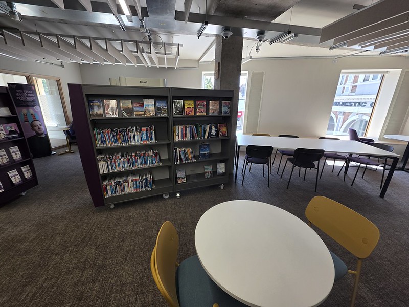
Some of the seating on the first floor. Unfortunately for my carefully prepared prejudices, I rather liked it. The main library space felt spacious without becoming cavernous and there was a genuinely decent selection of books which seemed properly curated rather than simply arranged to fill shelves. There was a useful mixture of seating, plenty of power points and free wifi, so it worked equally well for somebody wanting to browse, read, study or sit with a laptop pretending to undertake something they consider important. This latter category perhaps represents a substantial proportion of modern economic activity. The official design includes expanded collections and dedicated quiet study areas, and in practice it actually felt as though some thought had gone into how people might want to use a modern library.
More seating on the first floor and there was certainly space and I was particularly impressed by the acoustics. Modern open public buildings can sometimes achieve the remarkable feat of amplifying every conversation, dropped object and excited child across several thousand square feet, but that wasn’t the case here. The children’s section has its own dedicated area, including a castle-themed library and play space, but it felt sufficiently separated that children could enjoy themselves without the rest of the library having to enjoy themselves at precisely the same volume. The rest of the building remained pleasantly quiet, which is one of those qualities that ought to be fairly fundamental to a library but can no longer necessarily be taken for granted. This seems a remarkably sophisticated concept and I hope knowledge of it spreads to certain other libraries.
There were also enough different sorts of chairs and tables that nobody appeared to be fighting for the one tolerable place to sit. I suppose a criticism could be made that the library was really very quiet, but I think I can manage to cope with that. I strongly dislike Norwich Central Library, there’s no space, the acoustics are terrible, the surroundings are too loud and it’s much more comfortable and quiet in JD Wetherspoon. I haven’t been since they reopened the library last week, but I’m pre-annoyed about that too.
The local history section and I’m pleased to say that they had a Pevsner Architectural Guide to the area, my usual measure of the usefulness of the library.
There were also some old books on display, something which always pleases me. This book is the “List of Mayors and Notables Events 1348-1659” and it was published in 1660. I rather like the idea that somebody reached the end of 1659 and decided that more than three centuries of municipal administration really ought to be written down before everyone forgot what had happened.
This book from 1653 is an early anatomy book and I’m not convinced by the accuracy of this plate.
So I was surprised and delighted, which is mildly irritating when I had made such a good start on disapproving of the whole thing. I still prefer the old Carnegie building as a building, and I suspect I always will. A handsome Edwardian library opened by Andrew Carnegie himself has an architectural and historical advantage which a converted Argos is unlikely to overcome. But as a functioning library for King’s Lynn in 2026, the new building is spacious, quiet, comfortable, well equipped and apparently very carefully thought through. I went in expecting to mourn what had been lost and came out thinking that, actually, they might have got this one right. All really rather lovely.
This newspaper article was in the Norwich Mercury 200 years ago this week, reporting that Mr Snasdell had died from drowning. Not only do I like the word se’nnight, meaning a seven day period, but I particularly like the “the vital spark had fled” to describe his death.
The individual was Thomas Snasdell and he was buried in Mundesley on 7 August 1826, although he lived in Norwich. He had been born in 1782 and although not mentioned in the article, he married Ann Clarke on 6 September 1824. I will have to work out how to put the phrase “the vital spark had fled” into this blog somehow, it’s a phrase that I feel needs to return.