After the excitement of getting to Zadar Airport, the rest was something of an anti-climax. The airport is very much lacking in seating, so I found a place to sit and wait outside, but it all felt a little sub-optimal. There were no seats at all in arrivals and just a handful in departures.
Matters didn’t improve when I tried to go through security, as my boarding pass was rejected and I was told to return in twenty minutes. I did, only for it to be rejected again and for another twenty-minute wait to be imposed. After the third attempt failed, I asked when passengers were actually allowed through. The security officer replied, “We never know,” which didn’t fill me with much confidence about their operations.
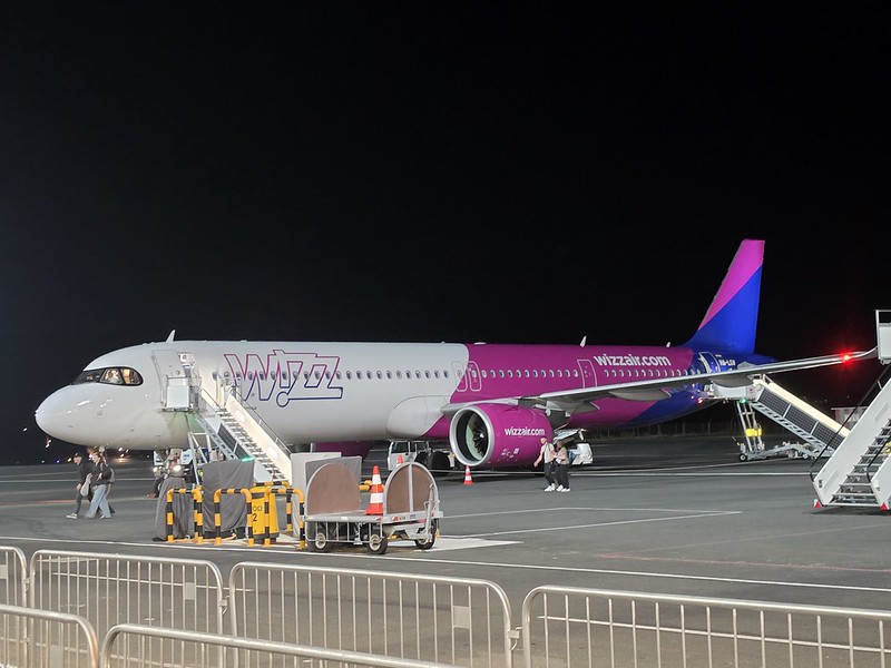
After popping into the lounge I watched the boarding commence and it was, as nearly always with Wizz Air, efficient and well managed.
The aircraft was HA-LGW, which has previously taken me from London Luton to Wrocław.
The seating gods had given me an aisle seat so that was most agreeable for the flight, which took around two hours. The flight was busy but once again beautifully uneventful, which is just as I like them. We landed around fifteen minutes early, although this probably owed more to Wizz Air’s generous timetable padding than any unusually enthusiastic flying by the pilot. One person applauded when the flight landed, but I’m pleased to record that they were ignored. There was the usual attempt by several passengers to push past everyone else when disembarking, a process that I’ve never entirely understood.
Oh good, a bus from the aircraft to the terminal at Warsaw. Unusually for this generally efficient airport, there was a delay of around half an hour before the buses arrived, which isn’t something I’ve experienced at Warsaw Chopin before. However, I was in no rush as I would be staying at the airport for a few hours before my flight to Georgia. Despite the delay, I still reached arrivals more quickly than those who had pushed past me, but I decided not to dwell on that modest victory. Given that this was a Schengen flight, there was no border control to go through, which made matters a little easier.
And this marks the end of the Balkans series of posts. Well, it does chronologically, although I am now going back to fill in several gaps, meaning that even the conclusion requires further instalments. It had been a rather lovely way to spend a couple of weeks, taking us through Serbia, Montenegro, Bosnia and Herzegovina, and Croatia without any genuinely serious transport disasters. By the standards of this trip, that represented considerable organisational success by Jonathan and me if I may say so myself.
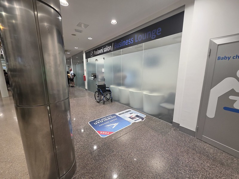
The airport lounge in Zadar is small, with seating for only around twelve people and so there was no guarantee that I’d get in. When I arrived, the receptionist checked and she confirmed that there was enough space for me, so I took the only unoccupied seat and thought it was all a bit intimate. Indeed, I had to ask a helpful German couple if they could plug my laptop cable in as the plug socket was nowhere near me and quite near to them. It’s good to chat I suppose.
The receptionist was polite to me, although she was perhaps a little direct to a couple of other people coming in, but she is trying to manage quite a small space and that would likely get to me after a while. There were three people who were refused entry into the lounge because of a lack of space and she told them to sit near the entrance and she’d call them when there was availability. It all felt a little sub-optimal.
I usually try to avoid taking photographs containing identifiable people, but almost the entire lounge fitted into a single frame, making that rather difficult. Given that little challenge, I’ve blurred the faces, but it demonstrates how little space there was.
There were a couple of beers, so I thought that I’d take the opportunity to try the Ožujsko beer from Zagrebačka Pivovara which was light, dull and uninspiring. There was also a range of soft drinks in the fridge, while the receptionist prepared hot drinks on request. I tried a few different Schweppes drinks to ensure that I remained suitably hydrated for the flight.
There were some odd-looking pre-packed sandwiches that I decided to ignore, so crisps were the mainstay of my food intake in the lounge. I couldn’t work out how to access the cupboard containing the crisps, so I waited patiently for somebody else to access it so that I could carefully watch their technique. I didn’t want to cause a scene or appear to have been defeated by a cupboard.
As this was included in my annual lounge pass, it was a perfectly good way to spend a couple of hours, have some notionally free crisps, beer and soft drinks all whilst charging my devices. I’m not sure that I’d pay to go in here though, the selection was limited and gaining admission appeared to depend partly on timing and partly on whether eleven other people had already had the same idea.
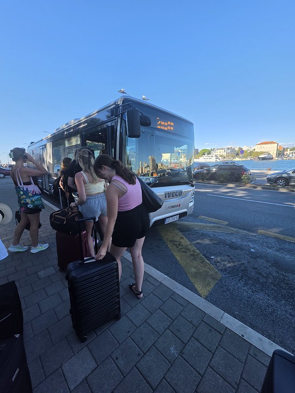
My initial plan was to get the airport bus to, well, the airport. As can be seen here, I was doing very well with this strategy, until a customer in the queue told me that the card machines had all broken on the buses. As a card only person and with no Jonathan available, that meant matters were becoming more complex. The bus driver told me that there was another bus, but when pushed slightly, he admitted that the card machine was broken on that too. I did think to myself that this wouldn’t happen in Poland, but I decided not to say anything.
So, I came up with a plan. It’s quite hard for me to withdraw money due to how my card set-up works, and it would cost around €7 in fees to do so anyway on top of what I drew out. I had a look at Uber and realised that a taxi would cost €13. My plan was to walk towards the airport while waiting for the Uber fare to fall. Against all reasonable expectations, this strategy actually worked. I watched the price decline from €13 to €11 and finally to €9, transforming an inconvenient walk into a very small but surprisingly satisfying exercise in transport market speculation.
At that point, I ordered the Uber, which immediately sent a message to my friend Liam as part of my security settings. This was a pleasant little interruption for him, as he had presumably begun his day hoping to become my remote Croatian transport supervisor. The driver arrived promptly and, with all that arranged, I reached the airport safely and in good time for my flight to Poland.
By now I was back on my own, I thought I’d pop and get a pizza and a beer as that seemed a sensible decision. Pizzeria Tri Bunara was well reviewed and it also had some seats on its terrace and so I opted for that.
I selected a table for two, while customers who occupied tables substantially larger than their groups required were soon repositioned by the waiter. I approved of this positive intervention and it added some drama to proceedings.
I was served promptly and the waiter seemed friendly and helpful, so this seemed a pleasant place to spend an hour or so. Some local cats provided additional entertainment by meandering through every now and then, making it feel like a basic cat café without the tiresome requirement to pretend that I had visited primarily for the cats.
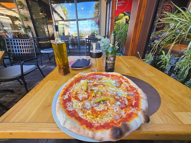
The pizza arrived after around ten minutes and was larger than I had expected, which immediately pleased me. I had ordered the Picante, topped with salami, spicy pepperoni, bacon and whole pickled green chillies. The chillies added some welcome heat and acidity, while a bottle of chilli oil was provided immediately on request. The pizza tasted freshly made, with a generously topped centre and a well-risen crust.
The beer was Karlovačko Crno, a 6% Croatian dark lager brewed using three varieties of malt. It had a roasted, caramel character and rather more flavour than some of the pale lagers I had encountered during the trip, so it proved a good companion to the pizza.
I spent a relaxing hour watching the world go by and observing further customers being repositioned by the waiter. The prices were reasonable, the pizza and beer were both enjoyable and it was nearly time to make my way towards the airport. Jonathan had left me unsupervised, but surely nothing could now go wrong.
This was the final day of the Balkans trip, with Jonathan getting a later coach to Zadar and flying out the next day, whilst I had an evening flight to Warsaw. This is the coach station at Split and the ticket office here makes clear that they can’t help with locating the coaches and although it’s fair that it’s not something they can help with, perhaps the coach station management might want to improve matters here.
Jonathan had come with me to ensure that I got the right coach, or, more precisely, to check that I had gone.
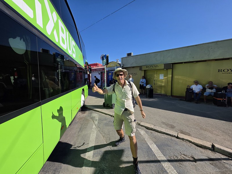
Although I had booked a FlixBus, it noted that it was operated by a third party and wouldn’t have their branding. It transpired that it did and after checking with the upbeat and helpful driver that I was boarding the right coach, I was ready to board marking the end of another memorable trip.
Jonathan waved me off, his thoughts presumably already turning towards his return to Norwich the following day. He was perhaps also relieved that responsibility for my geographical whereabouts had finally passed to somebody else. Although I didn’t know this at the time due to my last-minute booking habit, I was still to visit Warsaw, Kutaisi, Katowice and Barcelona before I got back to the UK. No point in keeping things simple and that means my loyal blog readers still have plenty more posts to wade through.
Although the coach was at capacity, boarding early meant that I got a decent seat on the upper deck. The coach was clean, although the power sockets didn’t work and the air conditioning was struggling to do much useful, but it was a cheap and cheerful way of moving along the Croatian coastline with the ticket costing £11. There are also regular services in case something goes a bit wrong with the whole arrangement.
Leaving Split I got to see Diocletian’s Aqueduct which was constructed in the early part of the fourth century, at the same time as Diocletian’s Palace that we had looked around the previous evening.
The countryside near Pristeg, with the Velebit Mountains visible in the distance. After several days beside the Adriatic, the route now felt noticeably drier and more rural, although I felt that I had enough photos of the countryside through the window to last me for a while.
Safely into Zadar coach station on time and with a thirty-minute walk to the historic heart of the city, slightly longer than I had been hoping for in the hot weather. I’m not sure whether I’ve actually mentioned in recent posts that it was getting a bit hot again on the Croatian coastline.
Since there was a McDonald’s at the coach station, I used the opportunity to charge my devices and ordered a cooling Fanta and a beer. McDonald’s providing electricity, air conditioning and alcohol (of sorts) immediately made it one of Zadar’s more useful cultural institutions.
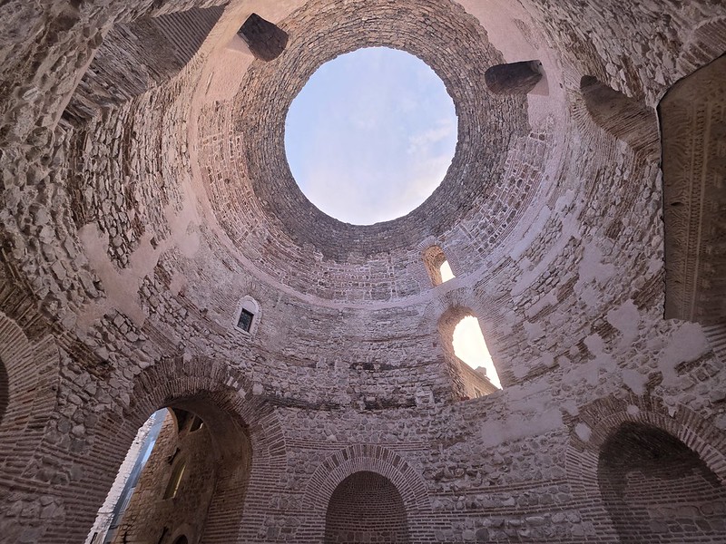
Continuing our rapid exploration of Diocletian’s Palace, Jonathan and I entered the Vestibule, the monumental antechamber which once connected the public Peristyle with the emperor’s private apartments. Constructed around the beginning of the fourth century, the building appears rectangular from outside but contains this imposing circular interior. Its dome has long since disappeared, leaving the large opening, which is slightly sub-optimal when it’s raining.
Beside the Vestibule is the Ethnographic Museum, which also provides access to more of the historic complex and a terrace overlooking the remains of the former cupola. We had only one evening in Split, though, and choices had to be made before Jonathan discovered that I had scheduled seventeen hours of sightseeing into approximately three. It also gives me a reason to go back in the future, although my list of cities I need to return to is growing ever longer.
The original interior would have been considerably more decadent than the exposed stone surviving today. Niches once contained statues, the circular walls were whitened and the great cupola was decorated with colourful mosaics which reflected the light. The Vestibule formed part of the carefully controlled ceremonial route towards the imperial residence, ensuring that anyone granted an audience had been suitably pre-impressed before Diocletian had even appeared. It appears that Roman emperors understood the need for a dramatic entrance to surprise and delight visitors without troubling themselves too much with the associated decorating costs.
The chamber remains impressive despite losing nearly all its decoration, helped by the height of the walls and the acoustics created by its circular form. Like most other parts of the Palace that were free to visit, it was rather packed with visitors, nearly all attempting variations of the same photograph directly upwards. Despite the crowds, this was one of the most memorable surviving spaces within the Palace and gave a sense of the scale of the building.
Jonathan and I only had one evening in Split and so we started at its most important site, namely Diocletian’s Palace. This was constructed around the beginning of the fourth century as a fortified retirement residence for Diocletian, although the buildings and streets within its walls gradually became the centre of Split itself.
This photograph shows the Silver Gate, the eastern entrance to the complex, alongside the former imperial mausoleum which was later converted into the Cathedral of Saint Domnius. Known to the Romans as the Porta Orientalis, the gate opened onto the decumanus, the principal street running east to west through the palace towards the Iron Gate.
Today, it’s very much a busy part of the city and the heart of its historic centre. It was a pleasant time of day to visit with the colourful sky, although lots of other people had a similar thought so there was some battling through the crowds to get around. Unlike during much of our time travelling around the Balkans, this felt like a city dominated by tourism and the vibe was very different.
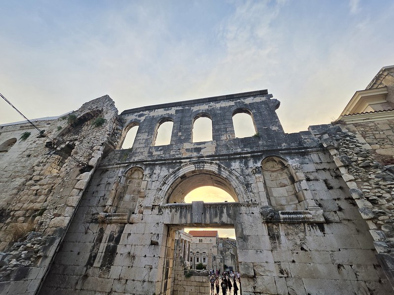
Seen directly from the front, the Silver Gate reveals rather more of its Roman design. Despite the name, it was built from limestone rather than an unexpectedly extravagant quantity of silver and was more modestly decorated than the Golden Gate on the northern side of the palace. It originally formed part of a more complex and decadent two-stage entrance, with outer and inner gateways creating a controlled defensive passage into the complex.
The two recessed niches on either side of the main arch probably once contained statues, long since lost, while the row of openings above belonged to the upper level used by the palace guards. It still felt like a proper defensive entrance, and enough survived for me to imagine how imposing it must have appeared to anyone approaching the palace without the correct authorisation.
The gate’s present appearance is partly the result of a substantial twentieth-century reconstruction. It had been blocked from the Middle Ages and remained closed until 1952, when the war-damaged Baroque church known as Dušica was demolished and the ancient entrance was reopened. The work exposed the Roman gateway and lowered the surrounding ground to reveal sections of the original paved route.
A photograph displayed at the site showed how the gate looked before the surrounding ground was lowered. It had been considerably less imposing, so I was pleased that the work had brought its appearance closer to the original Roman arrangement. The Silver Gate was used ceremonially in 2000 when Pope John Paul II passed through it on his way to the Cathedral of Saint Domnius. My own passage attracted less attention, although this made it substantially easier to take photographs.
Our evening meal in Split was at Tunaholic, a centrally located fish restaurant which has picked up plenty of positive online reviews.
The menu wasn’t overly large, which seemed a positive sign in terms of freshness, but there was still a reasonable range of dishes to choose from.
The menu also included photographs, removing the dangerous possibility that either of us might have to order entirely on trust. I must have been in an exceptionally good mood because I also agreed to sit outside voluntarily.
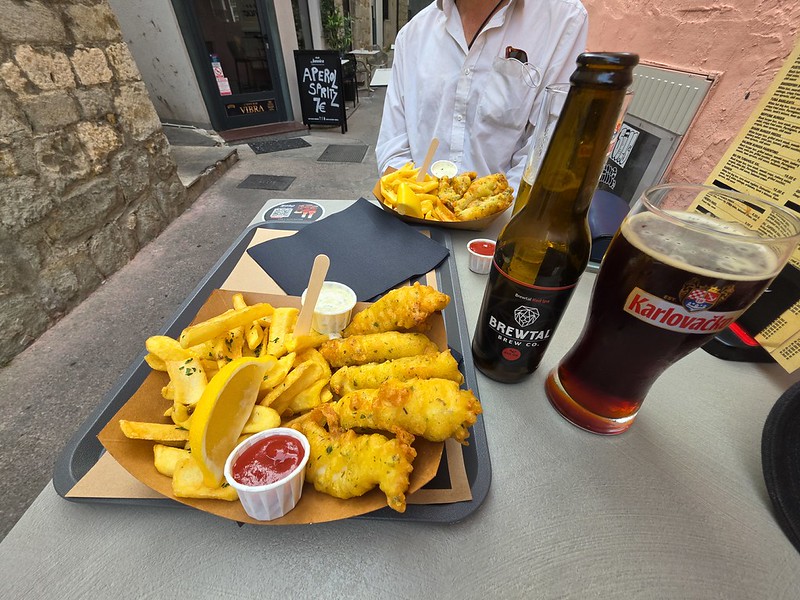
They had craft beer alongside some draft options and although they didn’t have the one I ordered, I was content with their recommendation of the Brewtal Red Ipa from Brewtal Brew Co. It was malty with a taste of toffee and I thought that it went well with the fish.
Jonathan ordered the Sardines Maximus, while I selected the Shark Marafor. I’m not sure that I had ever eaten shark before, but it was tender and full of flavour, while the tempura batter was crisp and well seasoned. The chips were crisp outside and fluffy inside, and the portion was generous.
This was one of my favourite dining experiences of the entire Balkans trip, which was particularly apt since it was the final night of our trip before we parted ways. I was certainly surprised and delighted by this one and even sitting outside had failed to cause a crisis. Tunaholic had substantially exceeded my expectations and what more could I ask for? I even left a tip at the end when paying…..
Another day and another coach trip, so we went to the supermarket to buy some snacks for the journey and I got my usual chilled coffee to start proceedings with. This had by now become an essential part of my transport infrastructure plans.
It was around a twenty-minute walk from our accommodation to the coach station and, as usual, we arrived in good time.
I was relieved to see that it was a proper coach that pulled up to take us to Split, which was going to take over three hours and I felt I’d enjoyed enough minibus journeys on this trip. It was unclear where we were supposed to sit on the coach and we were shuffled about until taking up the rear five seats between us.
The coach swept out of Mostar and I was pleased to discover that it had both air conditioning and Wi-Fi of sorts. I didn’t have roaming in Bosnia, but I did in Croatia, so this meant that I was able to breathe easily.
This is the border town of Čapljina in Bosnia and that’s the River Neretva. I didn’t take photos of the border crossing into Croatia, but the sedate arrangements in Bosnia were informal whilst it was very much Fortress EU when arriving into Croatia. Everyone’s passport was checked in person, the Entry/Exit System was in operation and it felt secure and well managed.
Many passengers seemed delighted when we stopped for half an hour. I’m not fond of these breaks, which usually appear designed to extract money from a captive audience through an overpriced café while making the journey longer. The driver presumably needed a rest, however, so I confined my protest to buying nothing and returning to the coach to sit by myself. This was unlikely to bring the business model crashing down, but my principles had been maintained.
Here I am back on the coach enjoying my alone time.
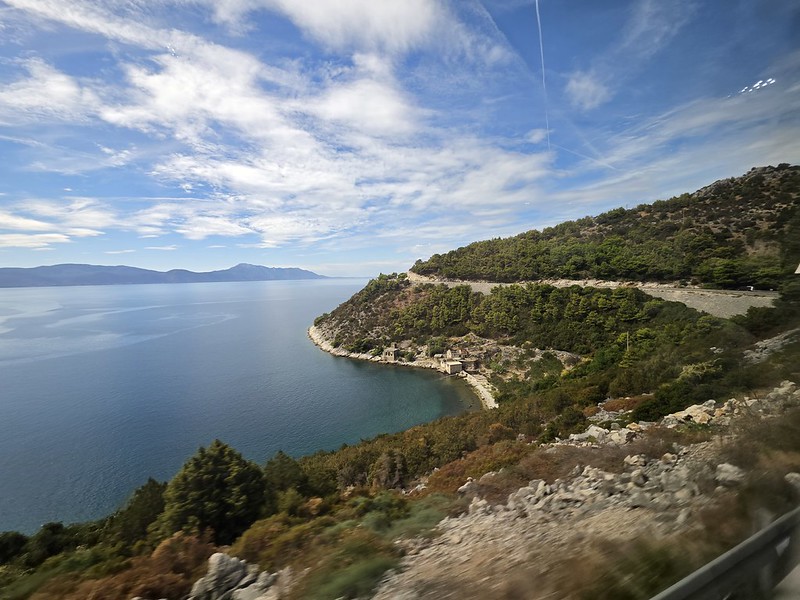
We then passed the Baćina Lakes, a group of remarkably beautiful freshwater lakes near Ploče. Taking photographs through a moving coach window did not entirely capture the scenery, although it did produce an extensive record of reflections, roadside barriers and occasional sections of lake.
This is Drvenik and the Adriatic was looking rather lovely. I’ve been to Dubrovnik many years ago, as well as Zagreb many years ago, but this was my first time travelling along the Croatian coastline.
The church in Makarska, photographed during one of the relatively brief moments when the coach, the building and my camera were all pointing in compatible directions without me appearing in the reflection of the window.
Located near the village of Dubci, the glorious views continued and I took several videos, which will make an appearance on this blog at some point.
I remember this coach trip fondly. The route delivered one coastal view after another and, unusually for a long coach journey, I was in no particular hurry for it to end.
This is Omiš and this stretch of coastline was more built-up and was evidently popular with tourists.
The harbour a couple of miles further along the coastline.
Then into the outskirts of Split and I liked the architecture of these buildings whilst noting that we had arrived on-time. We only had one evening in Split and I was keen to see what I could of the city.
This had been one of my favourite coach journeys, as it is rare to enjoy such consistently beautiful views for so much of a route. The proper coach, functioning air conditioning and absence of collapsing seats had also established an exceptionally high standard by this stage of the trip.
The entrance to the Partisan Memorial Cemetery sits relatively discreetly along the lower western flank of Bijeli Brijeg, where a broad cobbled avenue guides visitors into a shaded area. This cemetery was near to the accommodation where Jonathan and I were staying in Mostar, and it had caught our attention as an intriguing site with a traumatic recent past
The site was commissioned in 1959 and formally dedicated in 1965, with the monument being created to honour the hundreds of citizens from Mostar who died as anti-fascist Partisans during the Second World War. It was all designed by the Belgrade architect Bogdan Bogdanović and he wanted something more organic than just another graveyard with stones lined up in rows. His intentions were noble and it doesn’t take long to see what he was trying to achieve.
Today, the whole arrangement feels a little less peaceful when arriving as the car park was pot-holed, the site has nearly no signage and it almost feels like it doesn’t want visitors. Given the lack of signage, I was fortunate to have Jonathan there who has a much better retention of historical facts to help me piece this whole complex political jigsaw together.
Passing beyond the outer gate reveals the ramps that lead visitors further into the main part of the graveyard. I didn’t understand this section which doesn’t go anywhere, but I wondered whether it was formerly some sort of water feature. I had read that there were frequent issues with graffiti and that included Nazi symbols, although I only saw one example of this. This suggests that there is some routine maintenance going on here to stop things from getting worse, but that this doesn’t extend to restoring what has already been damaged.
Walking up to the main memorial, tens of thousands of rounded river cobbles and salvaged limestone blocks were brought up from the river-bed and old ruined houses across Mostar to build these structures. Bogdanović rejected the more traditional orthodox socialist-realist monuments of the time, so there are no statues of soldiers charging with rifles or massive hammers and sickles. Although the accessibility options aren’t great here, the walk up to the site did add some grandeur and anticipation if nothing else.
The path then transitions into a narrow, dramatic stone corridor flanked by towering walls, small niches and arched openings that feel like the backstreets of a fortified medieval town. Bogdanović openly described this complex as an architectural representation of historic Mostar, designed to mirror its narrow lanes and unexpected turns. It was meant to create an element of discovery, although I found this whole section a little sinister even in the bright sun.
There are beautiful views over Mostar and in the 1970s and 1980s, this space was used as a public park. Sadly, the site’s location on the western side of Mostar placed it on the frontline during the tragic 1992–1995 war, when the city was split by brutal fighting between Croat and Bosniak forces. In the decades that followed, the monument became an ideological flashpoint in a divided city, frequently suffering from severe municipal neglect, political deadlock and repeated bouts of vandalism. There were many people who wanted this graveyard to be restored, but there were many other competing demands on resources and a rather limited system of local government available.
Emerging into the main amphitheatre reveals the sheer scale of the memorial and it is an impressive sight to look at, with its former glory not too hard to picture.
Looking across the amphitheatre from its lower boundary gives more of a clear perspective on the site’s sweeping layout, but evidence of modern political hostility is now visible. In June 2022, the memorial suffered a sad act of planned desecration when vandals entered the site overnight and smashed around seven hundred headstones with sledgehammers, reducing decades of memory to rubble.
Although the site was declared a National Monument of Bosnia and Herzegovina in 2006, securing more reliable funding, maintenance and proper perimeter security has proved to be an endless struggle. I must note that 2022 felt very recent when we were reading about this site, a reminder of how challenging the problems in this city still are, however much things are getting better.
It’s hard not to be saddened by the current state of the cemetery, with broken fragments of stone strewn everywhere and pieces of litter scattered in between. Crouching down to read these fragments didn’t feel quite as they were intended to be read.
This stone marker commemorates Borivoje D. Zubac, a Mostar native born in 1917 who died in 1942 at the Mamula concentration camp at the age of just twenty-five. Mamula, an island fortress situated at the entrance to the Bay of Kotor, was converted by fascist Italian occupation forces into a brutal prison camp where hundreds of partisans and civilians were starved, tortured and executed. There aren’t many identifiable stones left now, so this one felt important simply because it had survived.
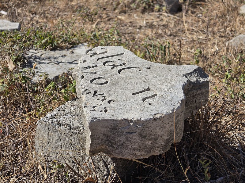
A short distance away lies another shattered marker resting in the dry grass and what makes this cemetery historically unique is that it includes the names of fallen fighters from every community across Mostar, with Bosniaks, Serbs, Croats and Jews resting together without distinction of faith or ethnicity. Yet even smashed and half-buried in the soil, these limestone fragments stubbornly preserve the identities of the citizens who laid down their lives, backed up by photos of the markers at https://partizansko.info/en/ before they were smashed up. Certainly in adding context to the history of this site, this website really is very useful and I’m pleased that it has a record of the stones.
Fresh spring water originally welled up from the centre of this stone structure before flowing down through the terraces and winding channels to the entrance below. Though the water has long ceased to run and the stone shows decades of weathering, this does offer something of a glimpse of what was once here. I’m also not sure that it would require a huge amount of resources to be restored, but the challenge is perhaps more in ensuring that it’s not vandalised again.
Looking towards the valley from the top of the cemetery, it all tells the story of peace and hatred which has unfolded in this region over recent decades. It remains haunting and extraordinary, so I was glad to see it, but hopefully in the future it can be restored once again. Our next stop was the Bruce Lee statue, something of a contrast to this, but it had the aim of trying to unify the different communities in Mostar.