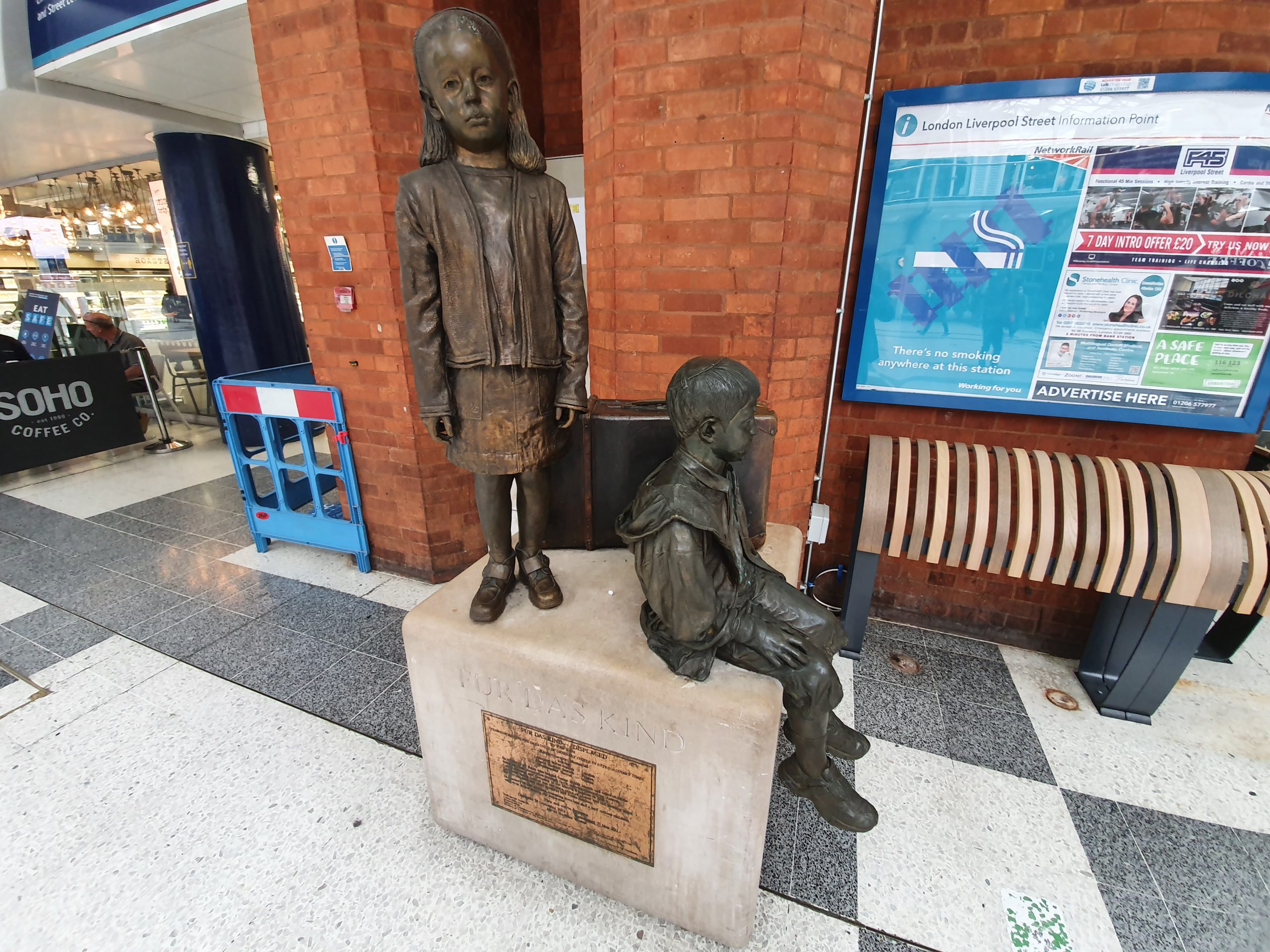

I’m booking a bit day to day at the moment, but returned to the YHA yesterday and their hostel which is located opposite the British Library and just a short walk away from King’s Cross St Pancras railway station.

These are not good times for the YHA as they can’t let out dorm rooms (or at least, they’re not letting them out if they’re allowed to). This meant that this en-suite four-bed dorm room cost me £22 for the night, something which I’m not sure was ever in their financial plan for the year.

The now switched-off air conditioning unit which is one of the largest I’ve seen and must have been from a previous incarnation of the building. There was also a working heater and fan in the room though to manage the temperature.

My own Dyson hand dryer for the evening.

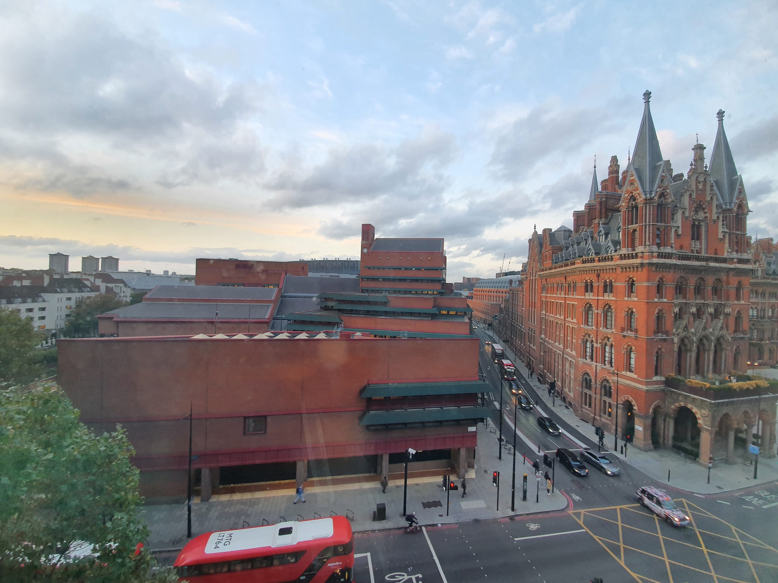
And a rather lovely view from the window. That’s the British Library on the left, reminding me that I haven’t used my Reader’s Card recently. The building on the right is the St. Pancras Renaissance Hotel, the hugely impressive hotel designed by George Gilbert Scott. It’s out of my price range as it’s five-star luxury, but it’s worth noting that British Rail tried to demolish it in the 1960s. Great foresight as ever.

And the same view at night.
The staff at the hostel were friendly, engaging and helpful, with everything being clean and organised. Hostels aren’t quite the same when they’re nearly empty, but that did at least mean that it was all quiet and calm. I also liked the sound of traffic outside, but it wasn’t that loud as there was some sound protection going on with the windows.
As an aside, this is a really well reviewed location as well, one of the highest of its type on TripAdvisor in London. It’s picked up just 17 one-star reviews over the years, a really low number given the variety of things that can go wrong in hostels. Although one person left a one-star review saying that she had stuff nicked from her bag, just as she had done in the same hostel the year before. She was brave to return. The guest that wrote “the ceiling collapsed leaving my bed filled with water and items of clothing and accessories were stolen from my case” didn’t seem to have had the best time….
Anyway, I thought it was excellent value for money, all rather lovely.