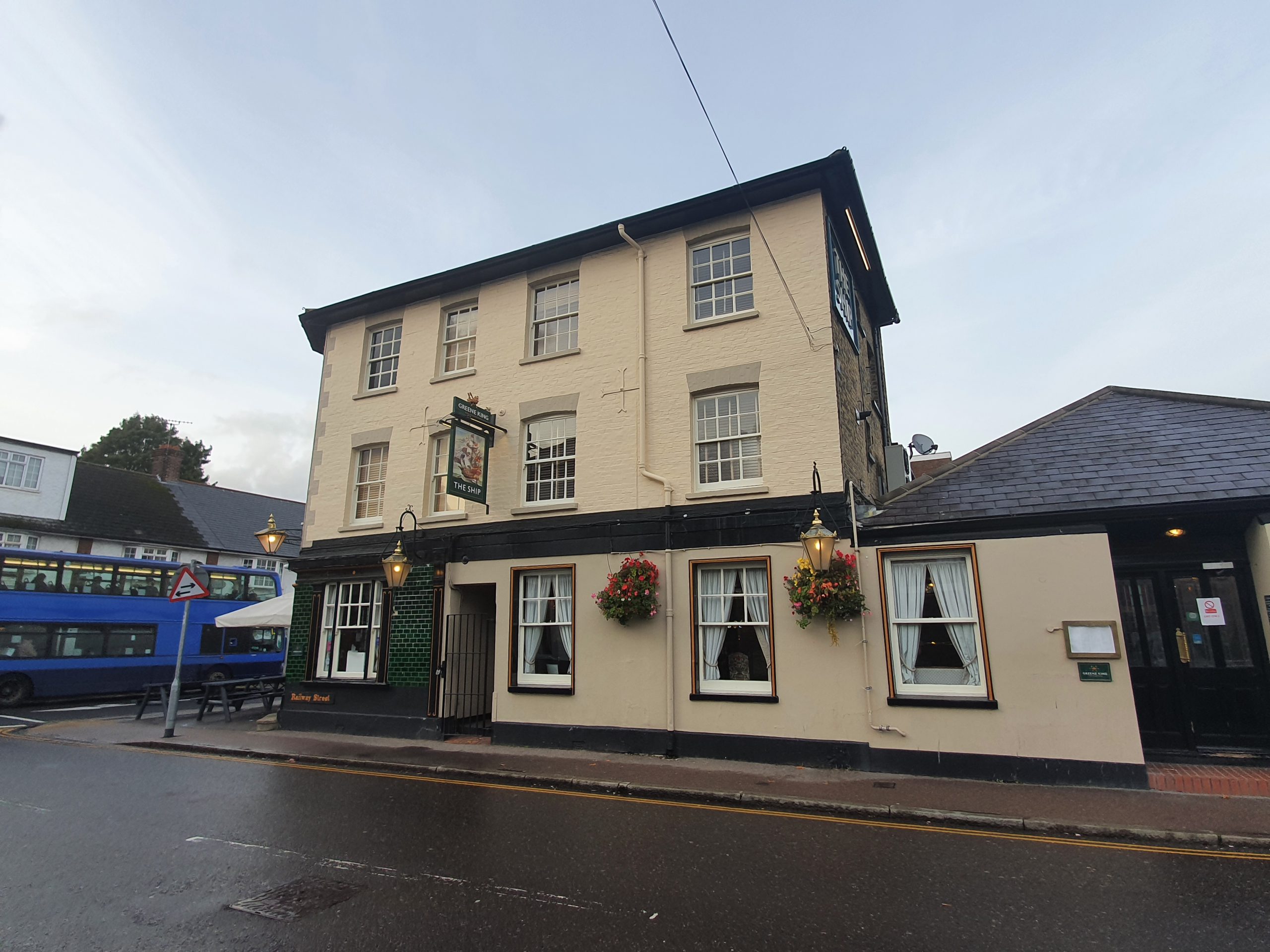
I’m not particularly keen on Greene King pubs, as I may have mentioned a few times before, as the excitement of choosing between Ruddles or Greene King IPA can be too much for me to bear. But, the Ship in Chelmsford is in the Good Beer Guide, so I felt there must be something special about it.

The interior is themed as a ship, which is handy given the pub name, and I like the decor as it’s quirky but not ridiculous. The pub was also busy when I visited in the early evening, indeed, busier than the other two Good Beer Guide pubs that I had just visited. Based on that popularity, it’s clear that the pub is doing more than just a few things right, with a really relaxed ambience.

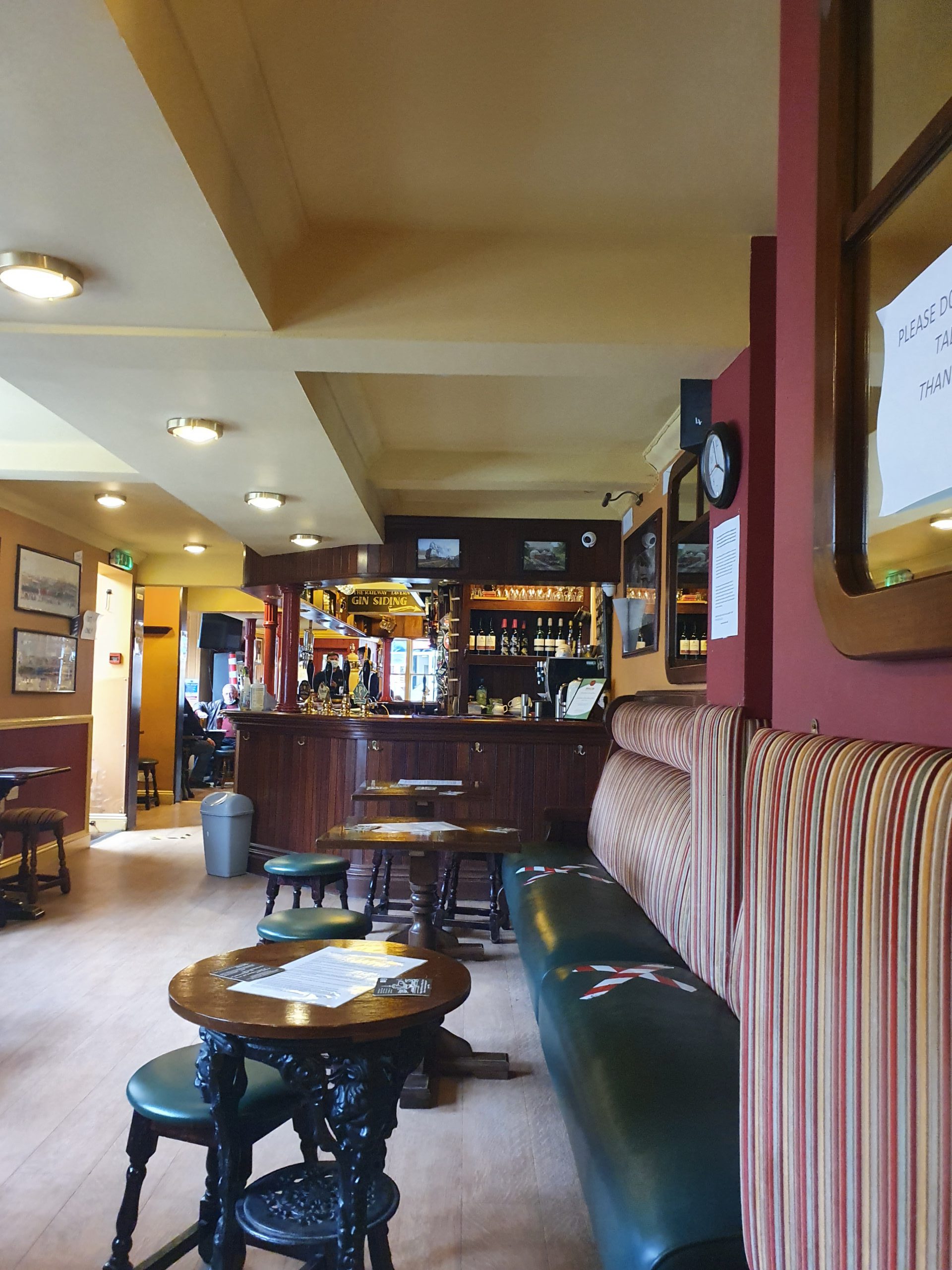
More ship stuff. In normal times I would have taken better photos and meandered around the pub looking at old things (decor I mean, not customers), but now isn’t the time to do that. The service was friendly, prompt welcome at the door, table service and a knowledgeable staff member. There were three beers from Greene King and one from Bishop Nick brewery, the Respect. This is a red ale which was acceptable if not riveting (note the word play there given ships….), which was the best choice I could see given that there were no darker options. It was all OK, but I’m not sure I’d want to recommend anyone comes here who likes craft beer or dark beer, but there are nearby alternatives for that.
One thing puzzled me (again), which is that the pub’s web-site says that its beers are supplied Ridley’s Brewery. Ridley’s Brewery was a major site in Hartford End, which Greene King bought out and shut down, like lots of things they do. The Bishop Nick beer I had is from a new brewery established by a relative of the Ridley family and they supply to a large number of pubs in Essex.

I’m not particularly bothered about what my beer is served in as long as it’s clean, although it’s not entirely usual to serve real ale in a Guinness glass. But, anyway, this pub is clearly providing a valuable community service (that sounds like some reoffender project) and the reviews are generally positive, particularly for the food which is served. Based on that heritage and welcome, I can see why the Ship is listed in the Good Beer Guide….