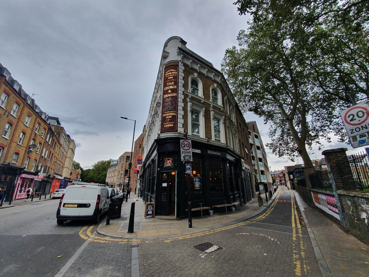

This is the UK outpost of Mikkeller, a Danish brewer who have become all rather on-trend. They’re located in what was the George & Dragon pub (although it was turned into a shop before Mikkeller took it over) which was rather smaller than I had expected.

The selection of beers, beautifully well balanced to ensure something for most tastes. They’re not the cheapest pub going, but the quality of the beers is high and there are some interesting options. The service was friendly, engaging and welcoming, with the staff members being knowledgeable about the beers.

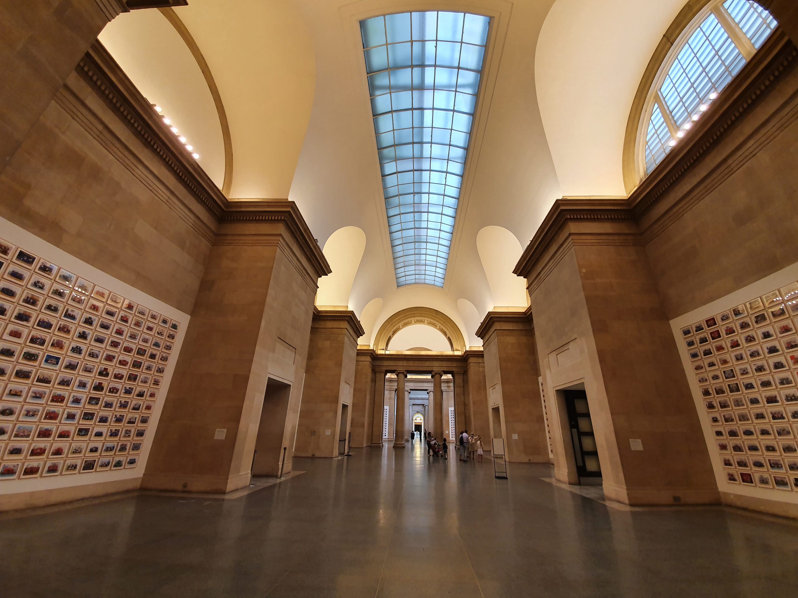
Part of the pub’s interior, it was otherwise busy and I was trying to avoid getting too many people in a photo that they might not have wanted to be in. I mentioned that my phone was low on charge (I’ve managed to forget to bring my battery pack with me this week) and I was hopefully shown a table which had a power socket by it, so that was a relief as I’d find it a little hard to cope without my phone….. (perhaps I need to get out more). The decor is just a little bit harsh and utilitarian, probably not conducive to people staying for a long time.

My two beer choices were the Dry Stout Centennial Mosaic from the Kernel Brewery and the Hallo Ich Bin Berliner Weisse Raspberry from Mikkeller. No prizes for anyone who guesses correctly which one the above photo is of. The stout is made by a small local brewery in London and had a smokiness and bitterness to it. The raspberry sour was piquant and flavoursome (that sounds pretentious I think, but there we go), both beers being very drinkable.
Anyway, all very lovely, although the bar was full soon after they opened, so I’m wondering whether they might be tempted to return to their more normal hours rather than the slightly more limited ones they’re operating with at the moment. The pub also has pizzas which are supplied from Yard Sale Pizza, a third party company, which did sound tempting and it’s a clever way of providing a food offering.